Each year, the Kaggle community answers the “State of Data Science” survey, which asks data scientists worldwide which tools they use most, which industry they’re in, what education they’ve been through, among other things. Fueled by the rich data, many people posted their analyses on the web, from looking at where people learn data science and which MOOCs they do to comparing the Kaggle and StackOverflow communities.
One of the analyses, in particular, caught my eye: “What Makes a Kaggler Valuable?”. By using survey data, the author builds a model to predict whether a survey respondent’s salary will be at the Top 20% of Kagglers and proceeds to make hypotheses about what you should do if you want to improve your salary, based on model coefficients. One of these hypotheses, for instance, is that if you want to earn more you should strive to be a Software Engineer, as its associated coefficient is larger than the coefficients of any other job description:
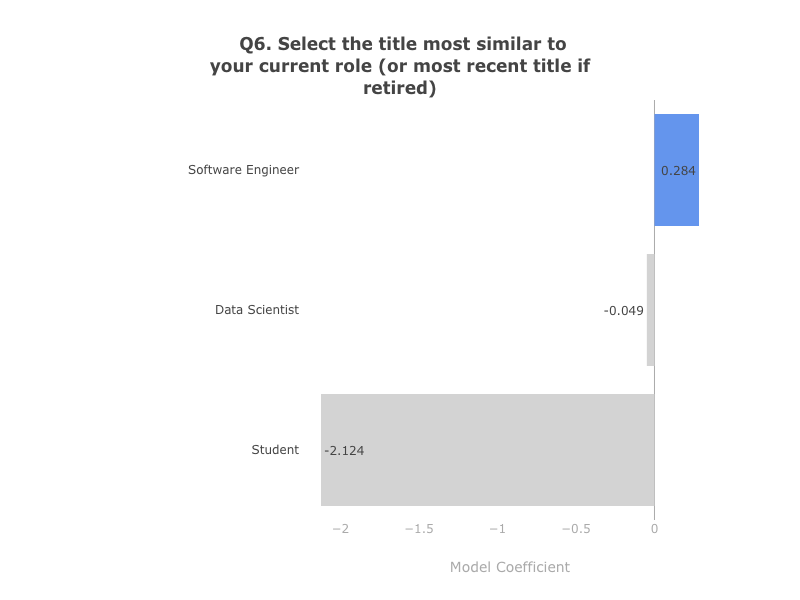
I was suprised by this, as it did not match with my personal experience (I am brazilian data scientist working in finance at the time). I was curious to see if this was true for people in the same context as myself. So, I loaded the same data used to train the model and checked how much Software Engineers were earning in comparison to people with other titles, for my particular subgroup (non-US, Male and working in finance):
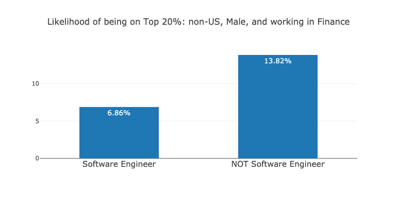
The number surprised me further. For people in the same context as myself, Software Engineers are 2 times less likely to be on the Top 20% than people with other titles! How could the model assign a positive weight for the Software Engineer title, then? It can be because Software Engineers earn more in the US, for instance:
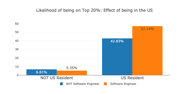
As we can see, being a Software Engineer seems to reduce your chances of being a Top 20% earner outside the US, while it increases your chances in the US. Also, just being in the US seems to greatly improve your chances of being a top 20% earner and reduces your chances of being a Software Engineer (16% to 12%, respectively). In the optimization process, the model may have tried to weight all the features and got confused by the underlying confounder (being or not in the US) and thus assigned a positive weight for the Software Engineer title as a general trend, even when this is not the case for many people.
To get a better result, we can improve this model in two ways: (1) make it more expressive, such that being a Software Engineer can have different impacts for different people (as opposed to being a single weight for everyone) and (2) make it causal, such that we accurately control for confounders, variables that affect both the outcome and the variable we want to measure. In this Notebook, I’ll use the excellent clean data brought by the first analysis and try to implement both improvements to build an expressive causal inference model just by combining off-the-shelf ML models and algorithms.
So… Let us begin!
Survey Data
I’ll use the excellent clean survey data used to fit the Top 20% earner model in the original Kernel. We have 185 dummy variables, representing answers to the survey questions. We also have the original target variable top20, a flag which is true if the respondent is among the Top 20% earners. To have more flexibility, I forked the Kernel and added numerical_compensation and normalized_numerical_compensation, the first just plain numerical compensation from the survey, and the second normalized by cost of living.
To make things more interesting, I use the raw compensation variables to create even more targets:
top50: whether or not the salary is above the medianpercentile,decileandquintile: in which percentile, decile and quintile the salary is in (all values are in percentiles)
We’ll use these variables further in the analysis. For now, let us talk about Simpson’s Paradox, to illustrate why being aware of causality can help us a lot in making hypotheses of what impacts earnings.
Simpson’s Paradox
Simpson’s Paradox is a statistical paradox where it’s possible to draw two opposite conclusions, depending on how we divide or aggregate our data. I really recommend this video from MinutePhysics which does a great job of explaining it. I’ll use the same example they did.
Suppose you want to measure the effect of money on happiness for people and cats, and you draw the following plots to analyze it:

By the two plots, it is clear that more money makes both people and cats sadder. But suppose that cats are richer and happier than people in the first place, and you had aggregated the two populations for the analysis:
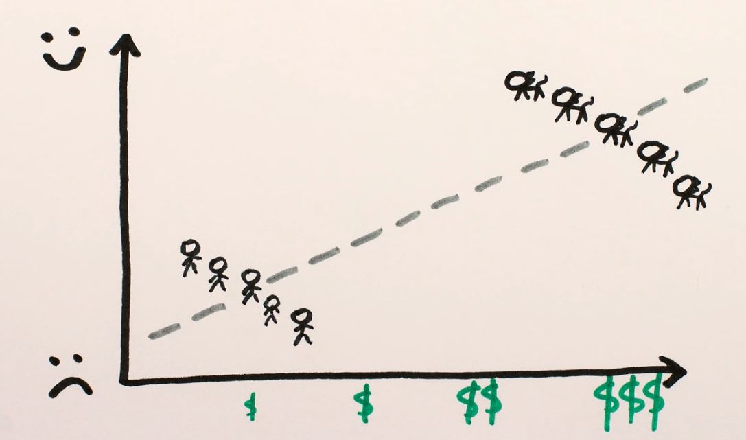
Here, it would incorrectly appear that money makes you happier as the general trend between the populations points this way. Most models are not guaranteed to perform these controls and could show the general trend when we look at the effect of an individual variable. We could try to regularize the model to mitigate the effect of the internal correlation between the variables, but this could lead overestimating the effect of money (the model could drop the “cats vs. people” attribute) or underestimating it (drop the “money” attribute). Which variable would be dropped could depend on an arbitrary choice, such as using L2 regularization instead of L1.
The catch here is obvious but actually quite hard to control in practice: we should only draw conclusions from comparable individuals on all other attributes apart from the variable we want to analyze. The cat vs. human comparison in the example makes it easy for us to understand this, but when we look at real, messy, and high-dimensional data (just like the Kaggle survey) it is not clear for us, humans, which individuals are comparable. But wait: we actually have a good model to determine which individuals are comparable! So that’s how our causal inference journey from ML begins!
Finding comparable individuals: Decision Trees
We want to measure the effect of being a Software Engineer on compensation. So the first thing we should do is actually find individuals who are comparable on every other feature that also impacts compensation. One of the first models that comes to mind is a decision tree. We fit the tree on all the explanatory variables, but leaving our treatment variable (being or not a Software Engineer) out. We use the letter W to represent our treatment variable, X for our explanatory variables and y for the outcome.
# choice of treatment variable - we do not include it in the model
treat_var = 'Q6-Software Engineer'
W = df[treat_var]

# design matrix, dropping treatment variable
X = explanatory_vars_df.drop(treat_var,axis=1)

# target variable
y = targets_df['top20']
# importing packages that we'll use
import graphviz
from sklearn import tree
from sklearn.tree import DecisionTreeClassifier

# let us fit a decision tree
dt = DecisionTreeClassifier(max_leaf_nodes=3, min_samples_leaf=100)
dt.fit(X, y)

# let us plot it
dot_data = tree.export_graphviz(dt, out_file=None,
                                feature_names=X.columns.str.replace('<','less than'),
                                filled=True, rounded=True,
                                special_characters=True)
graph = graphviz.Source(dot_data)
graph
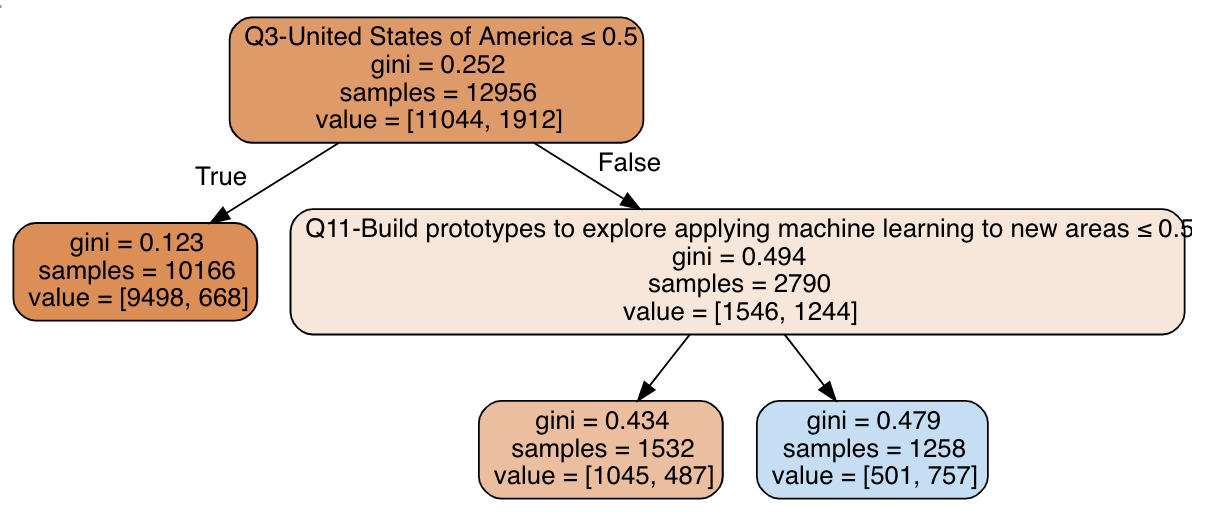
The tree split the data among three terminal nodes (leaves): (1) non-US residents, with the worst salaries, (3) US residents that build prototypes with ML, with best salaries and (4) US residents that do not build prototypes with ML, with average salaries. These are our best bet at comparable groups with respect to all variables (apart from our treatment variable) that predict compensation.
Let us now add our treatment variable and check how being a Software Engineer impacts compensation in each of these groups:
# creating a df to measure the effects
dt_effect_df = pd.DataFrame({'cluster': dt.apply(X), 'Q6-Software Engineer': W, 'avg. outcome': y})

# let us check the effects
dt_effect_df.groupby(['cluster','Q6-Software Engineer']).mean().round(2)
| cluster | Q6-Software Engineer | avg. outcome |
|---|---|---|
| 1 | 0 | 0.07 |
| 1 | 1 | 0.05 |
| 3 | 0 | 0.29 |
| 3 | 1 | 0.45 |
| 4 | 0 | 0.58 |
| 4 | 1 | 0.81 |
For cluster 1 (non-US), being a software engineer decreases your chance of being in the top 20% by 2 percentage points. On the other hand, we have a lift of 16 p.p for cluster 3 (US, not build prototypes) and 23 p.p. for cluster 4, (US, builds prototypes). So, if you’re in the US and your job description includes building ML prototypes, you should make even more money by being a Software Engineer!
That conclusion makes a lot of sense, which gives us confidence that we are on the right path. However, decision trees have a lot of weaknesses, such as being greedy (and thus sub-optimal) and overfit when they grow too much. Again, to our luck, there’s a simple way to solve this: forests!
Improving our clustering: Forests of Extremely Randomized Trees
To avoid known caveats of decision trees, let us use forests and explore how can we perform clustering with them. First, let us validate and fit an Extremely Randomized Trees model to our data (I’ll soon get to why we use ERT instead of a regular RF). As before, we do not include our treatment variable (Software Engineer) as an explanatory variable in the model.
# libraries
from sklearn.ensemble import ExtraTreesClassifier
from sklearn.model_selection import KFold, cross_val_score

# CV method
kf = KFold(n_splits=5, shuffle=True)

# model
et = ExtraTreesClassifier(n_estimators=200, min_samples_leaf=5, bootstrap=True, n_jobs=-1, random_state=42)

# generating validation predictions
result = cross_val_score(et, X, y, cv=kf, scoring='roc_auc')

# calculating result
print('Cross-validation results (AUC):', result, 'Average AUC:', np.mean(result))
Cross-validation results (AUC): [0.90718148 0.89097536 0.89666655 0.88904976 0.89180627] Average AUC: 0.8951358817370874
In general, we should do a hyperparameter search and choose the best model, but I find that ERT is hard to overfit, and this set of hyperparameters works well in most cases (in my personal experience). Nevertheless, an AUC close to 90% indicates that this model was successful in finding which variables predict the outcome, which in turn should lead to good clusters. Let us continue by fitting it to the full dataset, and checking the most important variables:
# let us train our model with the full data
et.fit(X, y)

# let us check the most important variables
importances = pd.DataFrame({'variable': X.columns, 'importance': et.feature_importances_})
importances.sort_values('importance', ascending=False, inplace=True)
importances.head(10)
| variable | importance |
|---|---|
| Q3-United States of America | 0.2 |
| Q24-10-20 years | 0.036 |
| Q10-We have well established ML methods (i.e., models in production for more than 2 years) | 0.024 |
| Q15-Amazon Web Services (AWS) | 0.022 |
| Q2-25-29 | 0.021 |
| Q2-22-24 | 0.019 |
| Q11-Build prototypes to explore applying machine learning to new areas | 0.018 |
| Q6-Student | 0.013 |
| Q42-Revenue and/or business goals | 0.012 |
| Q38-FiveThirtyEight.com | 0.012 |
The most important variable is being or not in the US, as expected, but there’s a lot of other variables that show up. Cool, but how do we find comparable individuals using this model? As with a single decision tree, we use its leaf assignments:
# and get the leaves that each sample was assigned to
leaves = et.apply(X)
leaves
array([[  57,  122,   52, ...,  113,   75,  528],
       [ 294,  531,  453, ...,  915, 1172,  914],
       [ 273,   43,  122, ...,  374,  597,  914],
       ...,
       [  33,   79,   25, ...,   45,   71,  457],
       [ 533,  314,  331, ...,  423,  189,  491],
       [ 356,  380,  244, ...,  428,  206,   46]])
The data in the leaves variable may seem confusing at first, but it really encodes all the relevant structure in the data. In this case, each row is a survey respondent and each column is a tree in the forest. The values are the leaf assignments: in which leaf of each tree each individual ended up into. The same logic applies here: when two individuals end up in the same leaf in a tree, they are similar. But how can we aggregate all leaf nodes and build a single similarity measure for the whole forest?
Supervised Embeddings: Similarity by leaf co-occurrence
The data stored in the leaves object actually describes a supervised high-dimensional sparse embedding of our data. One way to compute similarities in this embedding that I find very cool is to count at how many trees individuals were assigned to the same leaf. To illustrate this, let us count how many times the leaf indices from first row from leaves are equal to all the others:
# calculating similarities
sims_from_first = (leaves[0,:] == leaves[1:,:]).sum(axis=1)

# most similar row w.r.t the first
max_sim, which_max = sims_from_first.max(), sims_from_first.argmax()
print('The most similar row from the first is:', which_max, ', having co-ocurred', max_sim, 'times with it in the forest')
The most similar row from the first is: 6592 , having co-ocurred 88 times with it in the forest
How do they compare on the most relevant variables?
# number of variables that these guys are equal
n_cols_equal = (X.iloc[0] == X.iloc[6592]).loc[importances['variable']].head(20).sum()
print('Rows 0 and 6592 are equal in {} of the 20 most important variables'.format(n_cols_equal))
X.iloc[[0, 6592]].loc[:,importances['variable'].head(20)]
Rows 0 and 6592 are equal in 16 of the 20 most important variables
| index | 0 | 6592 |
|---|---|---|
| Q3-United States of America | 0 | 0 |
| Q24-10-20 years | 0 | 0 |
| Q10-We have well established ML methods (i.e., models in production for more than 2 years) | 0 | 0 |
| Q15-Amazon Web Services (AWS) | 0 | 0 |
| Q2-25-29 | 0 | 0 |
| Q2-22-24 | 0 | 1 |
| Q11-Build prototypes to explore applying machine learning to new areas | 0 | 0 |
| Q6-Student | 0 | 1 |
| Q42-Revenue and/or business goals | 0 | 0 |
| Q38-FiveThirtyEight.com | 0 | 0 |
| Q15-I have not used any cloud providers | 1 | 1 |
| Q8-0-1 | 0 | 0 |
| Q25-5-10 years | 0 | 0 |
| Q24-5-10 years | 0 | 0 |
| Q24-1-2 years | 0 | 0 |
| Q7-I am a student | 0 | 1 |
| Q11-Build and/or run a machine learning service that operationally improves my product or workflows | 0 | 1 |
| Q3-India | 0 | 0 |
| Q7-Computers/Technology | 0 | 0 |
| Q7-Academics/Education | 0 | 0 |
Cool. Our similarities seem to make sense. Now, to get a global view, we can do the coolest thing: reducing the dimensionlity of the embedding to 2 dimensions, putting all the similar individuals close together and dissimilar far apart on a plane. We do this with the help of a dimensionality reduction algorithm, such as UMAP:
# let us build a supervised embedding using UMAP
# 'hamming' metric is equal to the proportion of leaves
# that two samples have NOT co-ocurred (dissimilarity metric)
from umap import UMAP
embed = UMAP(metric='hamming', random_state=42).fit_transform(leaves)
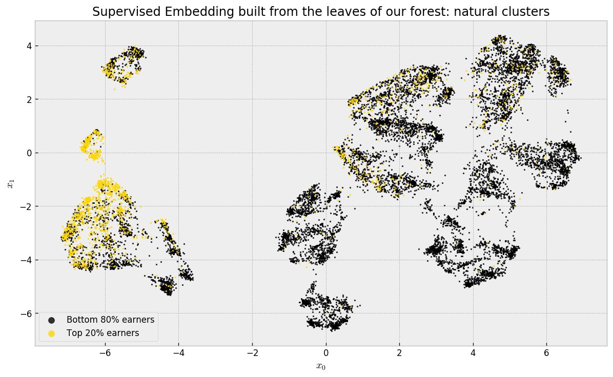
There’s a lot going on here, so let us take our time to analyze the plot. The first thing to remember is that we used our leaf co-occurrence similarities to build it: UMAP tries to organize similar respondents close to each other and dissimilar ones far from each other. Using hamming distance is the same as our leaf co-occurrence similarity. Therefore, we’re actually seeing the natural clusters in our data in a two dimensional approximation! As we did a supervised embedding, using similarities from a forest model trained to predict Top 20% earners, most of these guys are neatly grouped in tight regions.
Remember that we chose ERT over RF in the beginning? It’s because ERT, in my experience, builds “better” visualizations, because the similarities I’ve been getting from it are smoother. I wrote a blog post about it, with some experiments! Feel free to take a look!
In this map, if we take any local neighboorhood, we will find what we’ve been looking for: comparable individuals! To check that this is true, let us start by coloring the map by US vs. non-US residents:
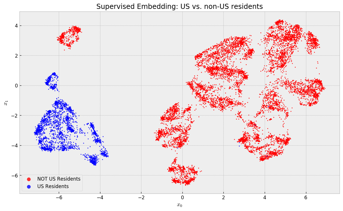
US residents are completely separated from non-US residents. No local (and thus comparable) neighborhood has any mix with respect to this variable. Let us check how people with 10-20 years of experience are distributed, the second most important variable:
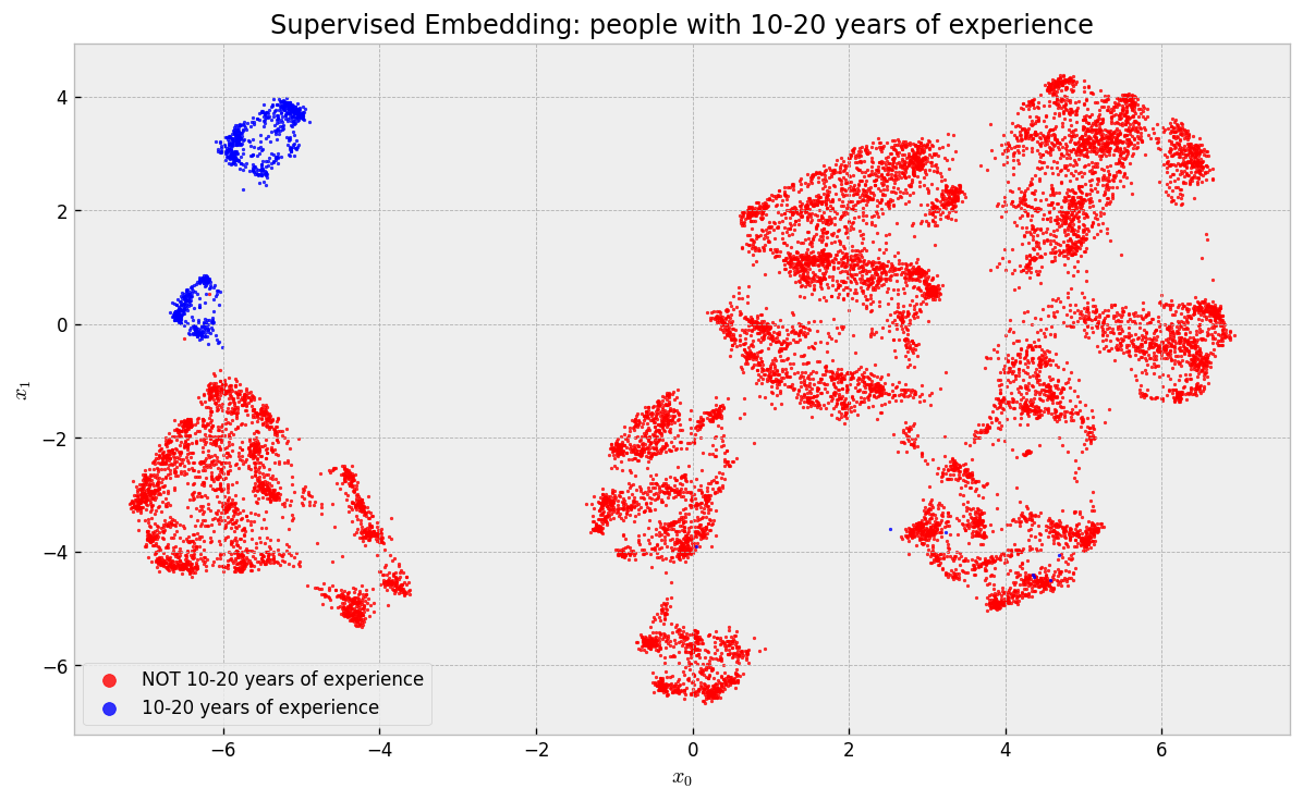
They concentrated in the two “islands” in the upper left corner of the map. If you backtrack to the last map, you’ll notice that one of these islands contains US Residents and the other contains non-US Residents. Finally, what about people that build ML prototypes?
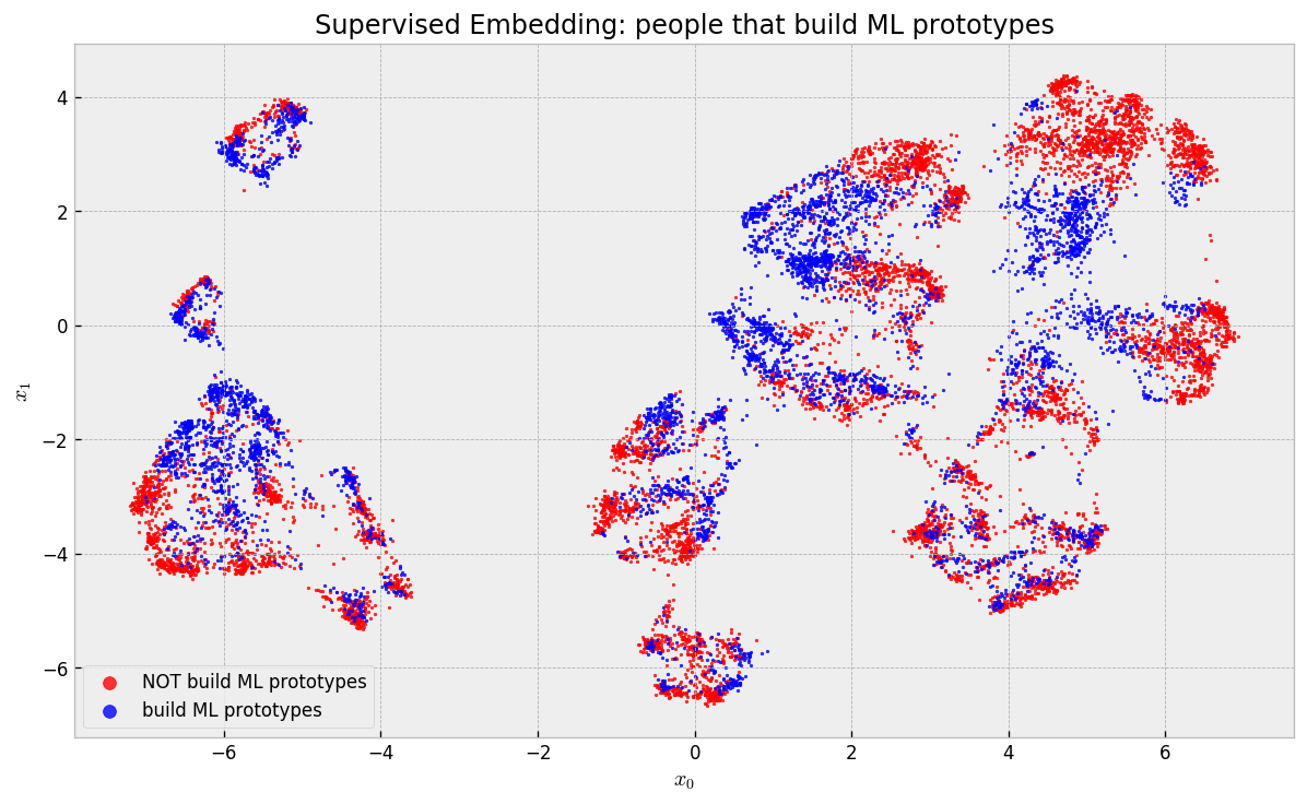
These guys are actually scattered across the map and clusters, but are tightly packed in local neighborhoods, maintaining our argument that we can find comparable individuals.
Cool, huh? We’re now actually very close to our ultimate goal of building an actual causal inference model. Keep going, we’re getting there!
Neighborhoods and Treatment Effects
Let us try to compute treatment effects now. To get a feel for how we can do it, let us take a look at one of our clusters, and how software engineers are distributed in it:
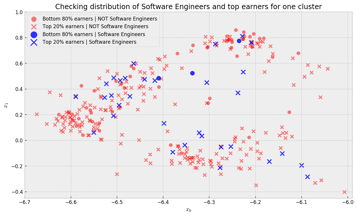
In the plot, blue points are Software Engineers while red points are not. Circles represent Bottom 80% earners and crosses represent Top 20% earners. There are regions where we get a good mix of blue and red points. As we did not include Software Engineer as an explanatory variable in the model, it could not cluster Software Engineers together to make predictions. Thus, we traded predictive power for dispersion, such that we can maximize the probability that for every untreated point (NOT Software Engineer) there is a handful of treated counterparts (Software Engineer), making it easy to compute treatment effects (lift given by changing Software Engineer variable while holding all else constant).
Note that leaving the treatment variable out does not guarantee it is evenly distributed on the map: it is not uncommon for treated samples to concentrate somewhere due to correlations with other variables, which makes impossible to calculate treatment effects. That’s why drawing conclusions from observational studies is hard: treatment assignments may be highly correlated with the explanatory variables and outcome.
Let us check one local neighborhood now:
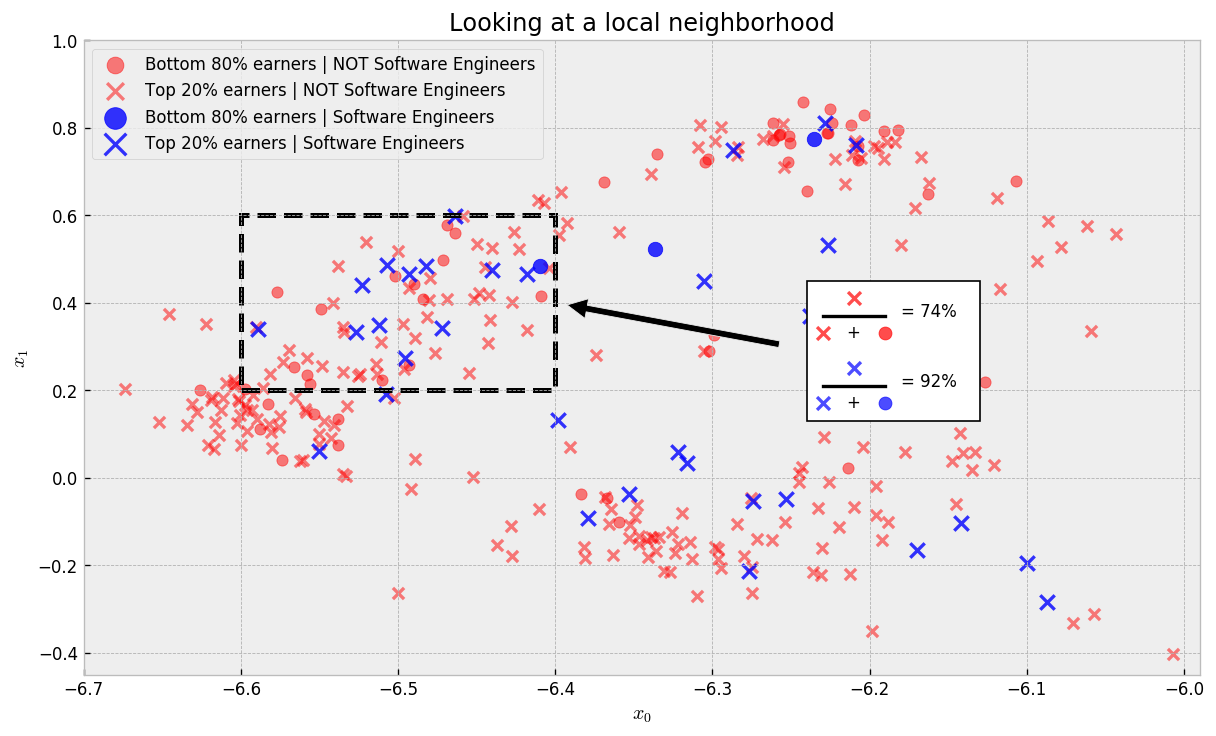
In this local neighborhood (where samples are comparable), the rate of top earner Software Engineers is 92% compared to 74% for non-Software Engineers, a lift of 18 percentage points. This is strong evidence that if someone in this neighborhood changed jobs to Software Engineer, we would see an improvement on his/her salary.
Given this intuition, we can devise an algorithm to systematically calculate treatment effects:
- Using our new similarity metric, we search, for each sample, its 200 nearest neighbors
- For each of these clusters, compute the average outcome for treated and not treated individuals
- Calculate lift as the difference between the average outcome for treated individuals and the average outcome for not treated individuals
We use NNDescent to get nearest neighbors:
# importing NNDescent
from pynndescent import NNDescent

# let us use neighborhoods to estimate treatment effects
index = NNDescent(leaves, metric='hamming')

# querying 100 nearest neighbors
nearest_neighs = index.query(leaves, k=201)
Then we do some pandas magic to prepare neighborhood data in a wat that is easy to compute treatment effects:
# creating a df with treatment assignments and outcomes
y_df = pd.DataFrame({'neighbor': range(X.shape[0]), 'y':y, 'W':W})

# creating df with nearest neighbors
nearest_neighs_df = pd.DataFrame(nearest_neighs[0]).drop(0, axis=1)

# creating df with nearest neighbor weights
nearest_neighs_w_df = pd.DataFrame(1 - nearest_neighs[1]).drop(0, axis=1)

# processing the neighbors df
nearest_neighs_df = (nearest_neighs_df
                     .reset_index()
                     .melt(id_vars='index')
                     .rename(columns={'index':'reference','value':'neighbor'})
                     .reset_index(drop=True))

# processing the neighbor weights df
nearest_neighs_w_df = (nearest_neighs_w_df
                       .reset_index()
                       .melt(id_vars='index')
                       .rename(columns={'index':'reference','value':'weight'})
                       .reset_index(drop=True))

# joining the datasets and adding weighted y variable
nearest_neighs_df = (nearest_neighs_df
                     .merge(nearest_neighs_w_df)
                     .drop('variable', axis=1)
                     .merge(y_df, on='neighbor', how='left')
                     .assign(y_weighted = lambda x: x.y*(x.weight))
                     .sort_values('reference'))
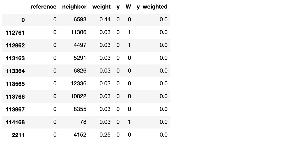
Here, we have in the reference variable all the samples in our dataset, and in the neighbor variable the 200 nearest neighbors for the corresponding reference. weight is the similarity from neighbor to reference. W is our treatment variable (if the neighbor is a Software Engineer or not) and y and y_weighted our outcomes, the first just pure outcomes and the second weighted by similarity.
More pandas magic leads us to the explicit treatment effect dataframe:
# processing to get the effects
treat_effect_df = nearest_neighs_df.assign(count=1).groupby(['reference','W']).sum()
treat_effect_df['y_weighted'] = treat_effect_df['y_weighted']/treat_effect_df['weight']
treat_effect_df['y'] = treat_effect_df['y']/treat_effect_df['count']
treat_effect_df = treat_effect_df.pivot_table(values=['y', 'y_weighted','weight','count'], columns='W', index='reference')

# calculating treatment effects
treat_effect_df.loc[:,'effect'] = treat_effect_df['y'][1] - treat_effect_df['y'][0]
treat_effect_df.loc[:,'effect_weighted'] = treat_effect_df['y_weighted'][1] - treat_effect_df['y_weighted'][0]

# not computing effect for clusters with few examples
min_sample_effect = 10
treat_effect_df.loc[(treat_effect_df['count'][0] < min_sample_effect) | (treat_effect_df['count'][1] < min_sample_effect), 'effect_weighted'] = np.nan
treat_effect_df.loc[(treat_effect_df['count'][0] < min_sample_effect) | (treat_effect_df['count'][1] < min_sample_effect), 'effect'] = np.nan

# observing the result
treat_effect_df.head(10)
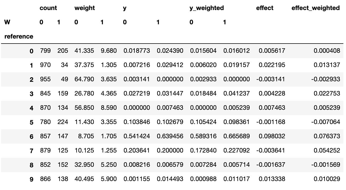
In this dataframe, we can explicitly compare outcomes for treated and untreated samples. We do not calculate effects for neighborhoods where there’s not a relevant number of treated or untreated samples (at least 10 samples, for instance), hence the NaN’s in the effect columns.
Now, we can return to our embedding and check where being a Software Engineer will give you a lift in compensation:
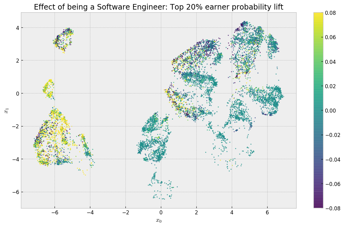
Cool! So let’s analyze this result: in the clusters on the left-hand side (mostly US-based or experienced professionals), we have a lift of a least 8 p.p for most of the respondents, while in the clusters on the right-hand side we have a lot of places that have zero effect and a few places where the effect is negative. Some points do not appear as there was not enough treated and untreated samples to calculate effects. There is also some noise due to the fact that for some clusters there is not much treated individuals (you can change the minimum number of treated or not treated individuals to consider an effect valid using the min_sample_effect parameter in the previous cells). As cool as this final map is, it would be nice to have a interpretable summary of what are the attributes that discriminate the effect of being a Software Engineer.
Again, Decision Trees come to the rescue!
Clustering based on effects: Decision Trees
The last step in our method helps us interpret what attributes discriminate treatment effects. To do that, we use a Decision Tree Regressor, fitting our explanatory variables to treatment effects. This way, it’ll build interpretable clusters for us.
# let us fit a decision tree
from sklearn.tree import DecisionTreeRegressor
dt = DecisionTreeRegressor(max_leaf_nodes=5, min_samples_leaf=100)
dt.fit(X.iloc[treat_effect_df['effect_weighted'].dropna().index], treat_effect_df['effect_weighted'].dropna())
# let us plot a decision tree
import graphviz
dot_data = tree.export_graphviz(dt, out_file=None,
                                feature_names=X.columns.str.replace('<','less than'),
                                filled=True, rounded=True,
                                special_characters=True)
graph = graphviz.Source(dot_data)
graph
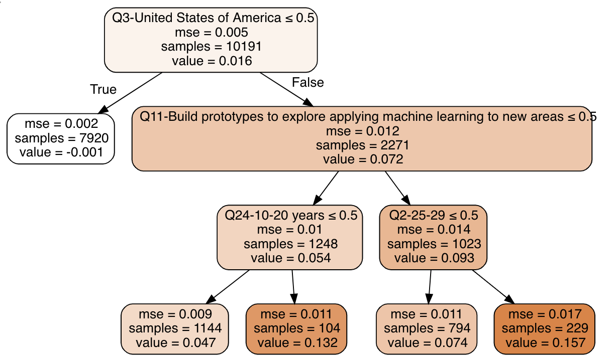
And there we have it: we found comparable individuals using forests, calculated treatment effects using neighborhoods, and built a summary of the effects using a decision tree!
The tree tells us that:
- If you’re not in the US, the effect of being a Software Engineer on your salary is close to zero
- If you’re in the US, the effect is larger when you have 10-20 years of experience or are 25-29 years old, and build ML prototypes as part of your job description.
And that’s it! Does that make sense to you? If you want, you can fork the notebook and change the max_leaf_nodes parameter to build more clusters.
I hope you liked the tutorial!!!! Any feedback is deeply appreciated!
If you want to continue exploring, please check my Kaggle Kernel for the effects of other interesting variables or fork the notebook and do your own experiments! If you want to read more about causal inference, I recommend reading about Generalzed Random Forests and the work of Susan Athey, as it was my inspiration for the simplified methodology I present here.